



Introduction
A kitchen color scheme shapes mood, function, and resale appeal long before appliances or handles are chosen. Strong planning keeps finishes balanced and prevents costly changes later. Light, texture, and room size all affect how paint, cabinetry, and benchtops read in daily use. With a clear palette, households can create a space that feels calm, practical, and current without chasing short-lived looks or crowding the room with too many competing tones.
Start With Local Light
Natural light changes every color choice. Brisbane kitchens often receive strong daylight, which can make cool whites feel sharper and warm neutrals look softer. Before selecting samples, households should test them in morning and afternoon conditions. A tone that looks balanced in a showroom may appear flat at home. Surface sheen matters too, because glossy doors reflect more brightness than matte finishes.
Match Color To Daily Use
Practical choices usually last longer than trend-led decisions. Families who cook often may prefer mid-tone cabinetry, because it hides marks better than stark white or deep black. In many Kitchen Renovations in Brisbane, planners weigh sunlight, traffic, and cleaning habits before choosing paint, joinery, and benchtops, which helps each element feel connected rather than randomly selected later.
Build Around One Lead Finish
Every strong palette needs a starting point. That lead finish might be a stone benchtop, timber grain, splashback tile, or cabinet color. Once that feature is fixed, supporting shades become easier to narrow down. This method reduces visual noise and keeps selection decisions faster. It also helps budget control, because fewer changes happen after materials have been ordered.
Use Warm Neutrals Carefully
Warm neutrals remain popular because they feel relaxed and adaptable. Soft beige, clay, mushroom, and greige can support many styles without looking plain. Still, balance matters. Too much warmth may make a kitchen feel dull or heavy, especially in smaller rooms. Crisp trims, pale stone, or brushed metal accents can add contrast while keeping the overall mood grounded and comfortable.
Add Dark Tones With Restraint
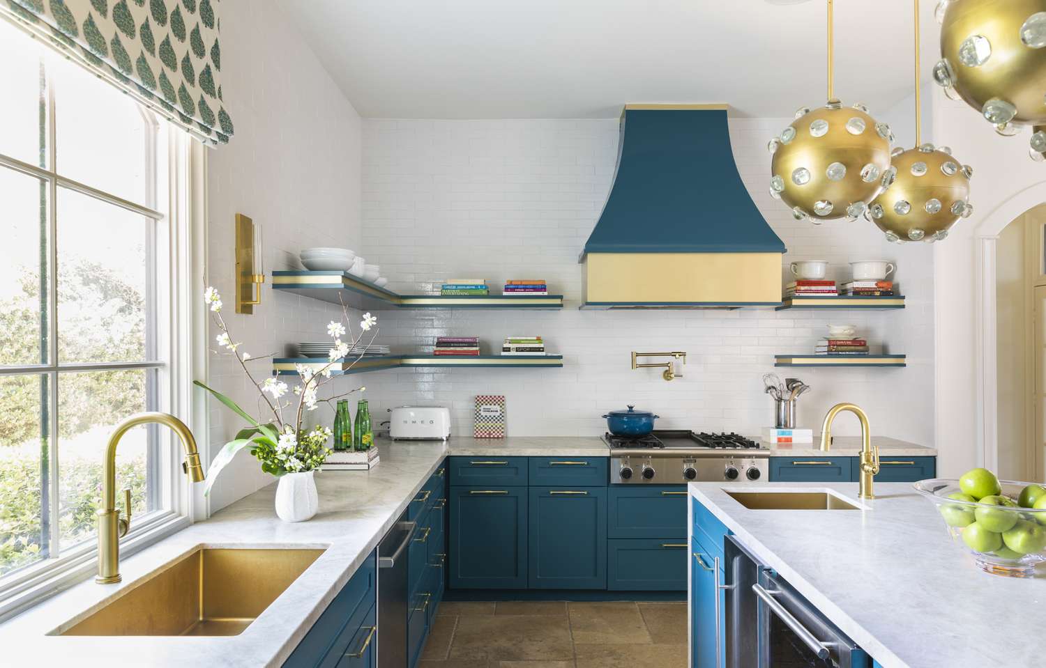
Deeper colors can give kitchens confidence and depth. Charcoal, olive, navy, and espresso work best when used with intention. Base cabinets or an island often carry dark tones more successfully than full-height joinery. Good lighting is essential, because darker finishes absorb brightness quickly. A controlled amount creates drama, while excessive use can make storage walls feel closed in and dense.
Consider Floor And Cabinet Balance
Flooring covers a large visual area, so it strongly affects cabinet color. Pale floors can support richer joinery, while dark boards often suit lighter cupboards and walls. Contrast should look deliberate, not harsh. If timber grain appears on both floor and cabinetry, the undertones need alignment. Mixing orange timber with cool grey joinery often creates tension that feels accidental.
Coordinate Benchtops And Splashbacks
Benchtops and splashbacks sit close together, so clashes are easy to spot. If the stone has bold movement, the wall surface should stay quieter. If the splashback carries texture or color, a simpler top usually works better. Repeating every shade from one feature into another is unnecessary. A tighter edit gives the kitchen a cleaner, more settled appearance.
Think About Hardware Early
Handles, tapware, and appliances influence color perception more than many expect. Brass can warm a cool palette, while black fittings sharpen lighter cabinetry. Stainless steel usually sits comfortably with most schemes, though it can feel clinical beside icy finishes. Choosing these details early prevents late mismatches. Small metal elements often decide whether the room feels polished or pieced together.
Test Samples At Full Scale
Small swatches rarely tell the full story. Larger painted boards, door samples, and stone offcuts reveal undertones far more clearly. These should be viewed beside flooring, tiles, and existing wall colors. Households benefit from checking them over several days, because weather shifts can change visual balance. Slower testing often prevents expensive regret and keeps the final palette coherent.
Conclusion
The best kitchen color scheme does more than look attractive in a photo. It supports daily routines, suits local light, and connects materials with purpose. Strong results usually come from restraint, careful testing, and a clear lead finish rather than from chasing every new idea at once. When tones, textures, and hardware work together, the renovated kitchen feels easier to use, easier to maintain, and far more satisfying over time.